“Retention and engagement are low because students don’t understand the meaning or depth of their results.”
My Role
Role: Principal Designer
Role: Design Team Lead
Reported to: Chief Product Officer
Overview
A redesign of the navigation and landing pages for the Results Platform that originated from secondary research that surfaced very poor retention and consumption metrics. Our product had just launched and our go-to-market strategy was, in part, dependent on students engaging with their results enough to share with others.

Problem
Based on observed behavior via MixPanel and resulting user interviews, we discovered that students weren't returning to engage with their results after the first visit. Only 16% of "Your Results" content was being consumed over a dismal 1.5 visits on average.
Together, we wrote the story to frame our sprint:
"As a student returning to the platform to see my exercise results, I want to understand the content so that I am intrigued enough to engage repeatedly."

Process and approach
As a first step, I collaborated with the Product Manager and CPO to design a research sprint including the following:
- 15 Question survey with incentive
- 5 User interviews from survey candidates
- 5 User acceptance testing sessions after prototypes
Our research sprint was designed to gather enough information to inform a redesign while providing enough time to allow for solution exploration, prototyping and user acceptance testing. Once the discussion guides were written, we booked 2 weeks to deliver our results.

Solution
Our design solutions explored two primary areas surfaced in our user interviews:
- Clarifying global options and representing feature value in the application through better navigation design
- Educating new users by illustrating the concept and benefits of the Results content through better interaction design, data visualization, and information design (infographics)
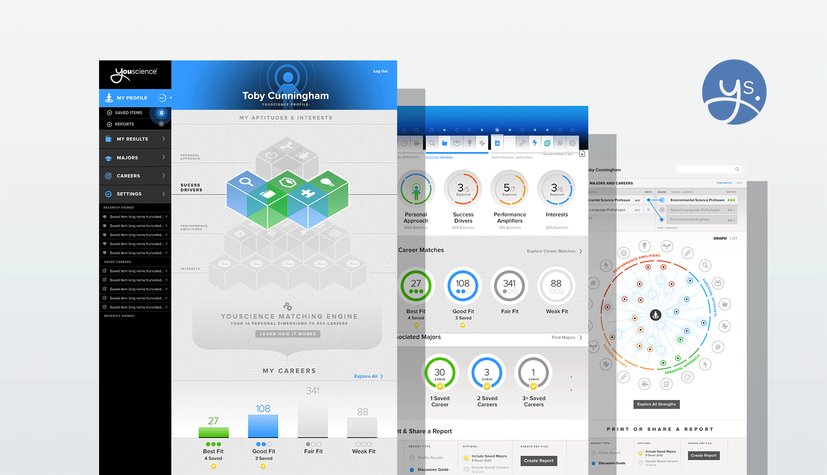
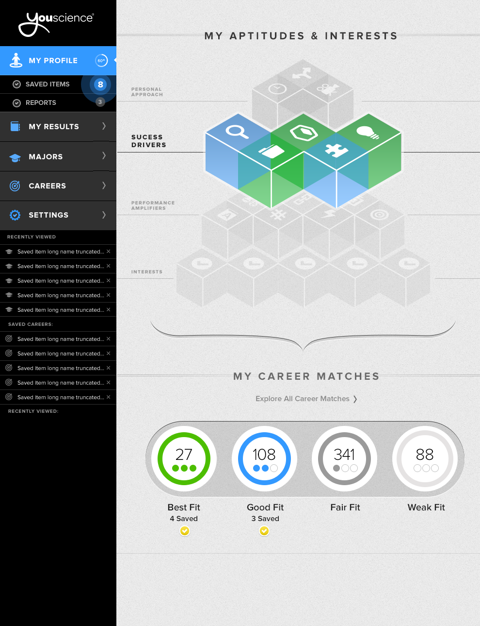
My team explored a number of approaches attempting to visually solve summary views of career matching, aptitude mapping, and relative scoring. We also completely re-architected the site architecture and labeling while adopting a sidebar navigation schema to accommodate personalization features to the top level.
Of candidates that participated in the follow up interviews and surveys, 98% accepted the redesign and preferred it over the previous solutions.
Process Examples
Early exploration of wireframes defined primarily by stakeholder requests. Used for testing with the beta group.

A failed attempt at solving the "mapping of selected major to career path" problem.

Early explorations of illustrating the relationships between Success Drivers, Performance Drivers, and Personal Interests. These are all secondary categories used by mapping personal scores to careers.
Continued exploration of integrating personal approach, success drivers, performance amplifiers, and interests into the framework that also includes a new navigation schema.


An early iteration of the Mandala.
The Mandala: A solution attempting to resolve the product problem of low engagement stemming from lack of clarity, while balancing the business rule stsating that no score should be represented as "high" or "low."
